Journal
Notes on coffee in art
Deep-dives on single pieces, comparative essays on the artists and printers who worked the same genre, short histories of the institutions whose collections we draw from, and practical notes on putting one of these pieces on a wall.
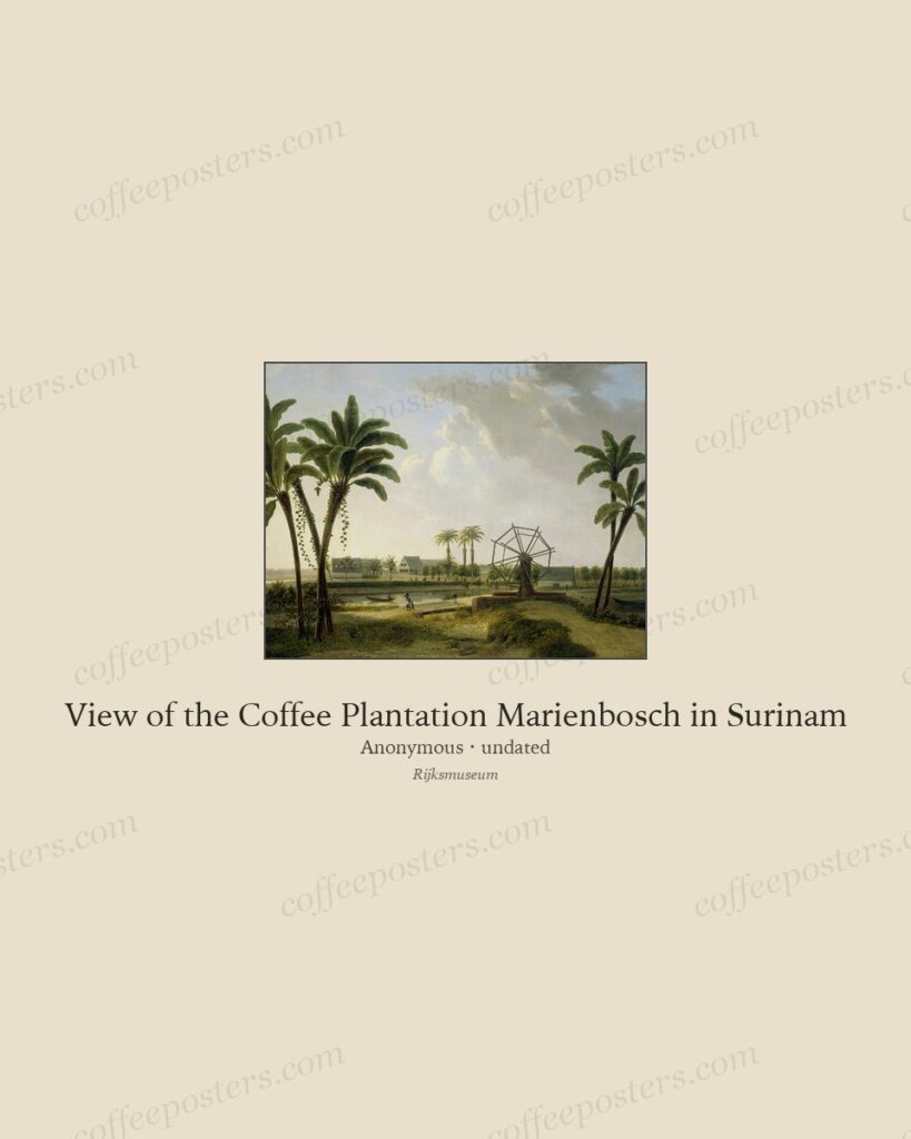
Indonesian coffee plantations in colonial Dutch art
Colonial Dutch art recorded the Indonesian coffee plantation in detail — the terraced hillsides of Java and Sumatra, the drying yards, the labour — producing images that are at onc
Read →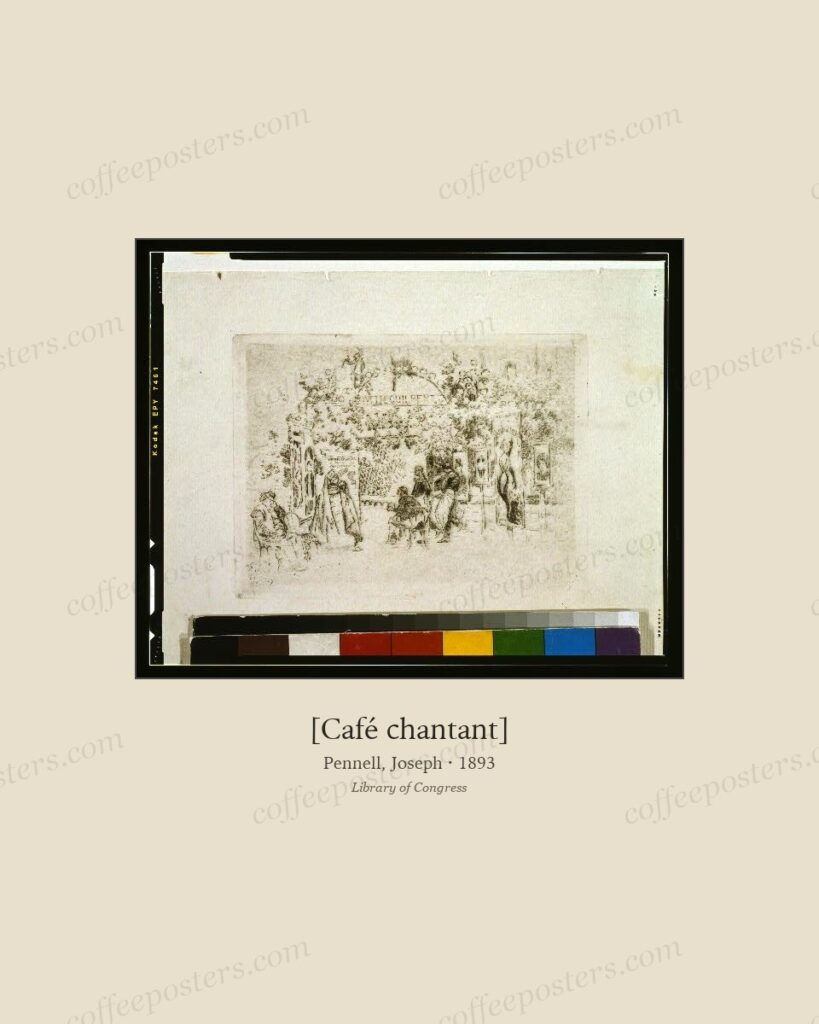
Mat width and colour for archival coffee prints
For archival coffee prints, a 5–8 cm mat in a warm off-white is the reliable default. Wider mats add gallery weight to small pieces; warm cream flatters aged paper where bright whi
Read →
Japanese coffee-trade-card art, 1900–1930
Japanese coffee advertising of roughly 1900–1930 fused Western coffee imagery with Japanese graphic conventions as coffee entered Japan through the kissaten café and imported brand
Read →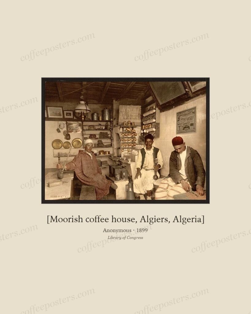
Frame styles by era: Belle Époque, Art Deco, botanical
Match the frame to the era and the piece holds together: a thin gilt or warm wood for Belle Époque posters, a clean black or chrome-look for Art Deco, and plain natural wood with a
Read →
The Ottoman coffee vendor in 19th-c. travel prints
The itinerant coffee vendor was a stock figure of 19th-century European travel prints of the Ottoman world: a man with a brazier, a long-handled cezve, and a tray of small cups, re
Read →
Best paper and finish for coffee art: matte, textured, giclée
For archival coffee art, matte is almost always right: a heavyweight matte or cotton-rag stock reproduces the character of lithographs, engravings, and paintings, hides glare, and
Read →
Paris café-concerts in Impressionist painting
The Paris café-concert — the café with a stage — was a central subject for the Impressionists and their circle. Manet, Degas, and others painted its singers, audiences, waitresses,
Read →
Printing a coffee poster: home vs. print shop vs. pro lab
For a coffee poster, a home printer is fine for proofs and small sizes, a local print shop is the value sweet spot for mid sizes, and a professional photo lab on archival paper is
Read →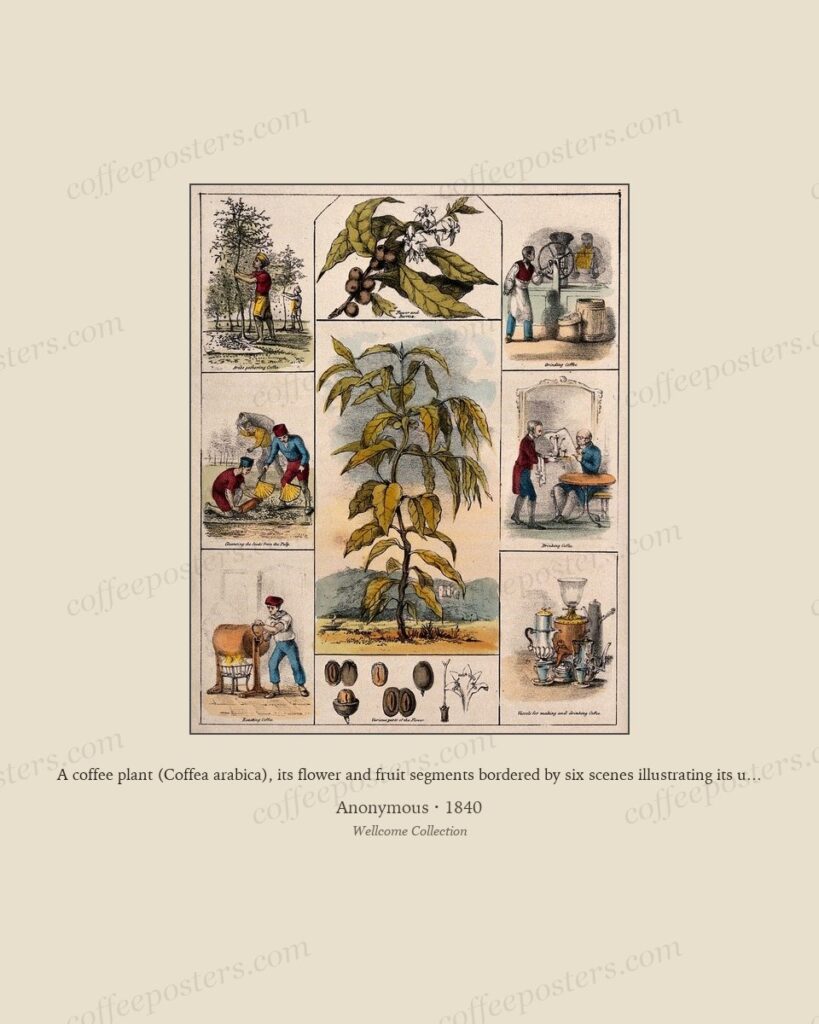
Dutch coffee-trade paintings: VOC era through 19th c.
Dutch art recorded coffee as commerce earlier and more directly than most. From the Dutch East India Company (VOC) era through the 19th century, Dutch painting and print documented
Read →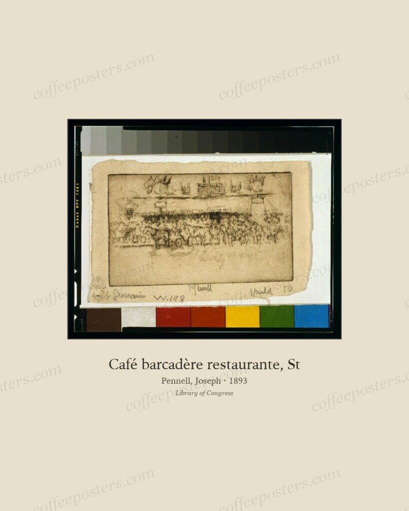
12 coffee pieces no specialty cafe should be without
Twelve pieces make a complete café collection because they cover all four registers of the coffee image: style (Belle Époque posters), origin (botanical plate and plantation landsc
Read →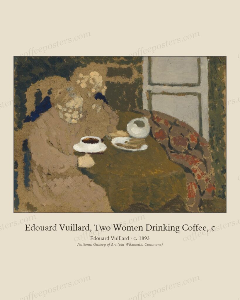
Coffee in 18th-century European salon painting
In 18th-century European painting coffee marks refinement and polite sociability: the porcelain cup, the small gueridón table, the elegant interior. Rococo painters used the coffee
Read →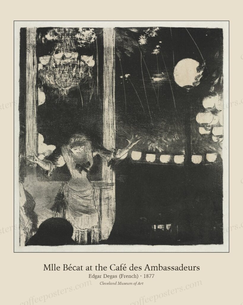
Restaurants vs. cafes: how the archive choice differs
Restaurants and cafés draw from the same archive differently. A café is coffee-forward with close seating, so it favours coffee posters and café-scene imagery, denser and hung low
Read →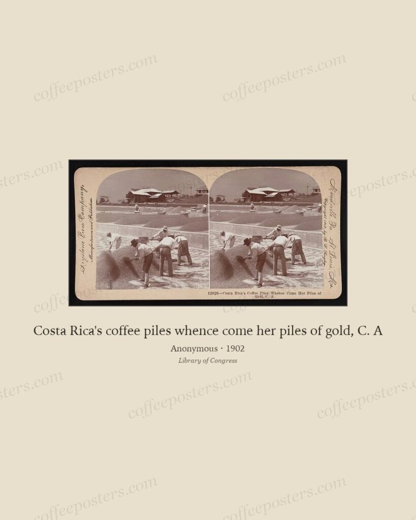
6 Belle Époque coffee poster essentials
Six posters cover the essential range of Belle Époque coffee advertising: the canonical Brussels Rajah, its Meunier tea companion, a French café affiche, a chocolate-coffee crossov
Read →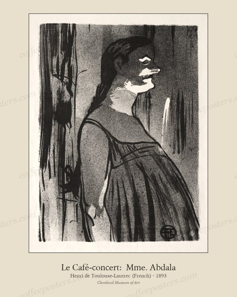
The roastery supply-chain wall: bean to cup in five pieces
A roastery wall can tell the whole supply chain in five pieces: a botanical plate of the plant, a plantation landscape, a transport or trade image, a roasting scene, and a drinking
Read →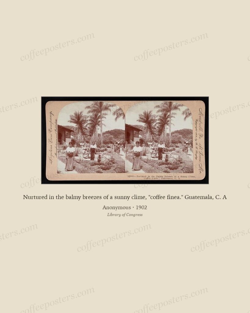
10 most pinnable coffee posters in the archive
The most shareable coffee posters have three things in common: a strong single subject, a confident colour, and a composition that survives a thumbnail. On a platform where images
Read →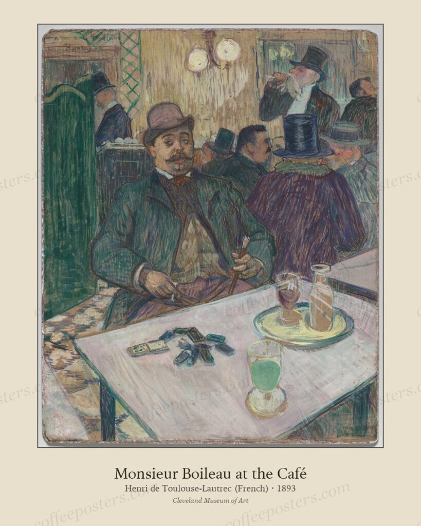
What the commercial-display license actually covers
The commercial-display use of an archival coffee print covers printing the file and showing the framed result in a business you operate — a café, roastery, restaurant, or hotel. It
Read →
Women in coffee advertising, 1880–1914
From roughly 1880 to 1914 the female figure was the default vehicle of coffee advertising: the idealised Art Nouveau woman served, poured, or personified the drink. The convention
Read →
Five cafe wall mistakes (and what to do instead)
Five mistakes ruin most café walls: hanging too high, mismatched frames, too many sizes, generic stock art, and poor lighting. Each has a cheap fix that is about discipline rather
Read →
Forgotten Belle Époque coffee brands and their posters
Most Belle Époque coffee brands are remembered, if at all, only by their posters. Small colonial-import houses across Belgium, France, and Germany — the Rajah house in Brussels, co
Read →
Hotel lobby cafes: scale, lighting, and what works
Hotel lobby cafés are large, bright, and seen from a distance, so they need scale and contrast: fewer, bigger pieces in heavier frames, hung higher than a domestic wall (155–160 cm
Read →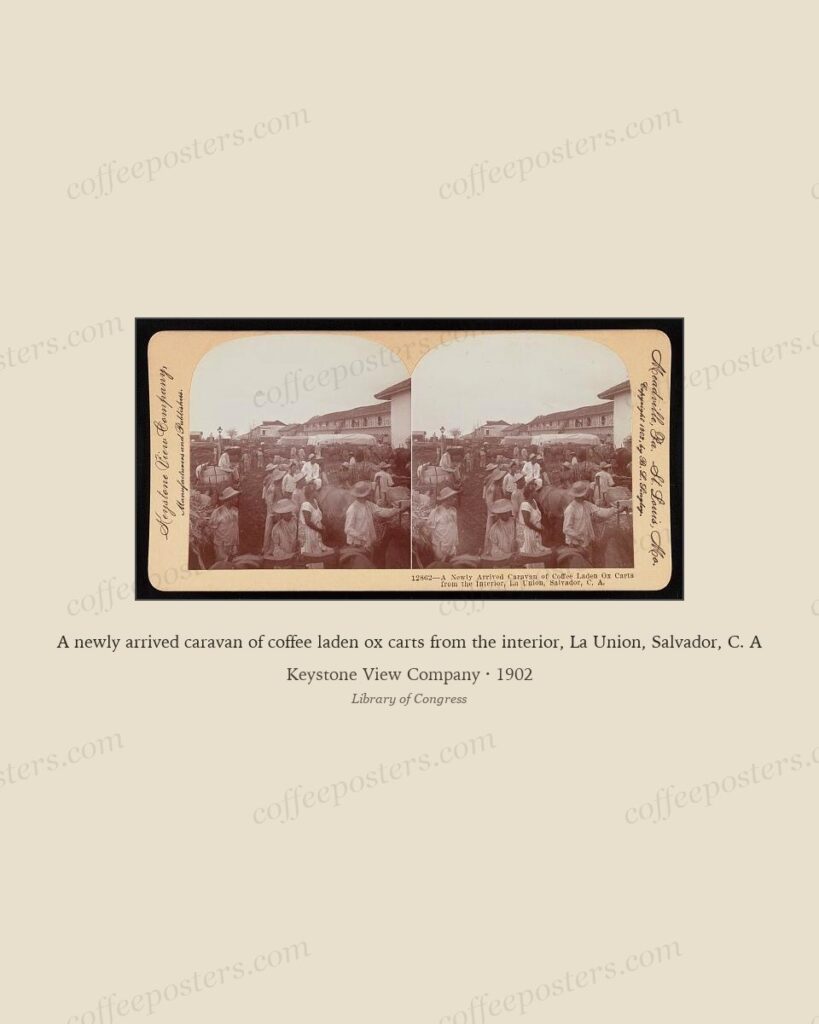
Vienna, Prague, Budapest: Eastern European Art Nouveau coffee design
Around 1900 Vienna, Prague, and Budapest ran their own Art Nouveau coffee cultures. Vienna gave the Secession and the geometric restraint of the Wiener Werkstätte; Prague absorbed
Read →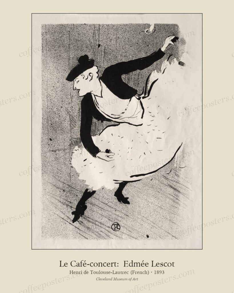
The home espresso corner: three pieces, no more
A home espresso corner needs three pieces, not twelve: one larger statement image and two smaller supporting pieces, framed identically and hung tight above the machine. It marks t
Read →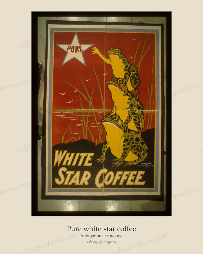
German Jugendstil and the Munich coffee poster
Jugendstil — the German-language form of Art Nouveau, centred on Munich and named after the Munich weekly Jugend (founded 1896) — gave coffee and beverage advertising a flatter, bo
Read →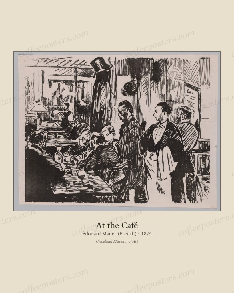
Hanging a 12-piece cafe wall: step-by-step
A twelve-piece coffee wall reads as curated when it is built on a grid: equal frame sizes, equal gaps, and a single centre line. Lay the whole thing out on the floor first, measure
Read →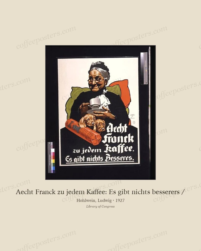
Italian futurism and coffee advertising, 1910–1930
Italian Futurism (founded by Marinetti’s 1909 manifesto) glorified speed, the machine, and the modern city — and coffee, the fuel of the new urban espresso bar, was a natural fit.
Read →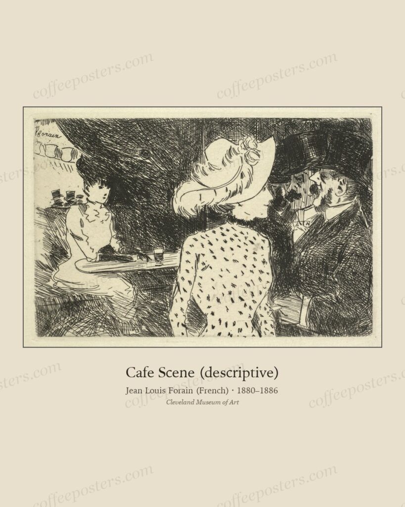
Matching frame stock across multiple archival pieces
To make a mixed set of archival coffee pieces read as one collection, match the frames, not the images. One frame profile, one mat colour, one mat width across everything unifies d
Read →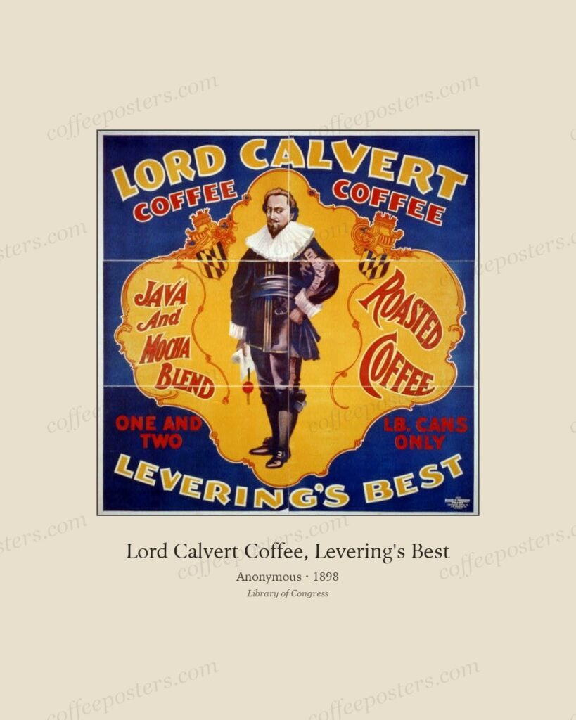
Art Deco coffee design: French, Italian, and Eastern European, 1920–1930
Art Deco coffee design (roughly 1920–1935) replaced Art Nouveau’s curves and Cappiello’s black-ground figure with geometry, flat colour, and integrated lettering. Named for the 192
Read →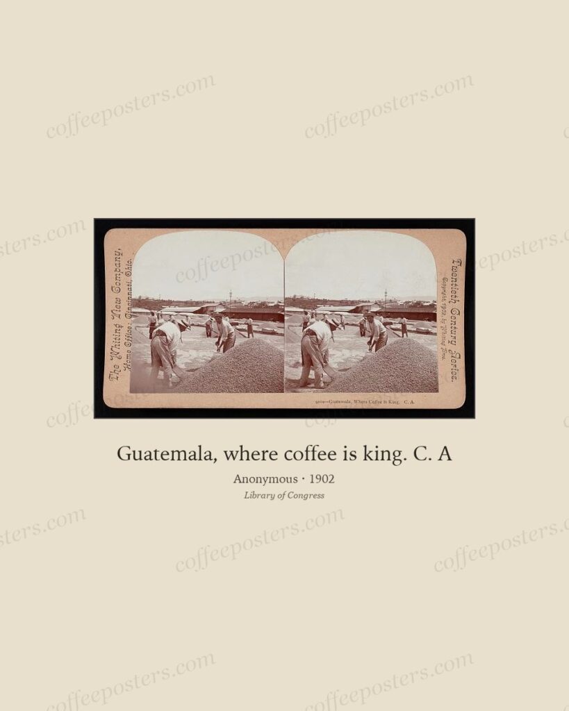
A visual history of coffee advertising, 1880–1930
Between 1880 and 1930 coffee advertising moved through four visual phases: the ornamental Art Nouveau poster of the Belle Époque; the single-figure Cappiello-style brand hook of th
Read →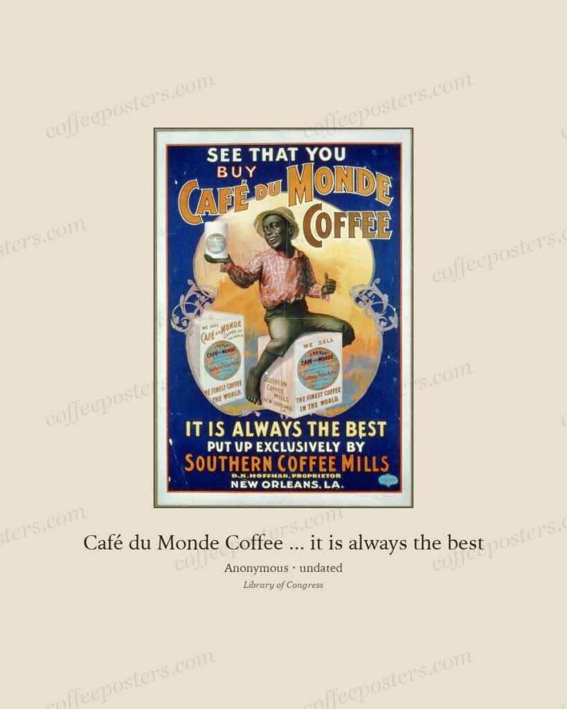
Chéret, Cappiello, and the French coffee poster tradition
The French coffee poster has two fathers. Jules Chéret (1836–1932) invented the modern colour poster in the 1870s and filled Paris with joyous, crowded lithographs; Leonetto Cappie
Read →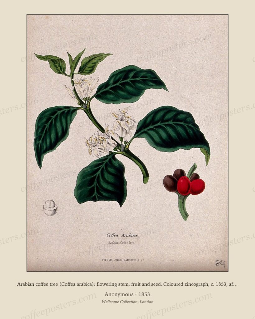
Albert Anker and the Swiss domestic coffee genre
Albert Anker (1831–1910), Switzerland’s best-loved genre painter, made coffee a recurring fixture of ordinary village life: the pot on the family table, the old man at the grinder,
Read →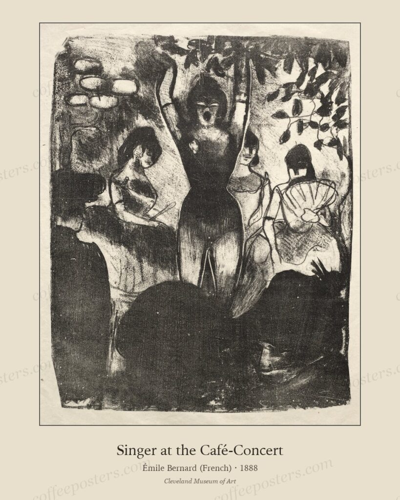
Designing a specialty cafe interior with archival coffee art
A specialty café interior built on archival coffee art reads as curated rather than themed when it follows three rules: choose pieces that share a period, a place, or a printing te
Read →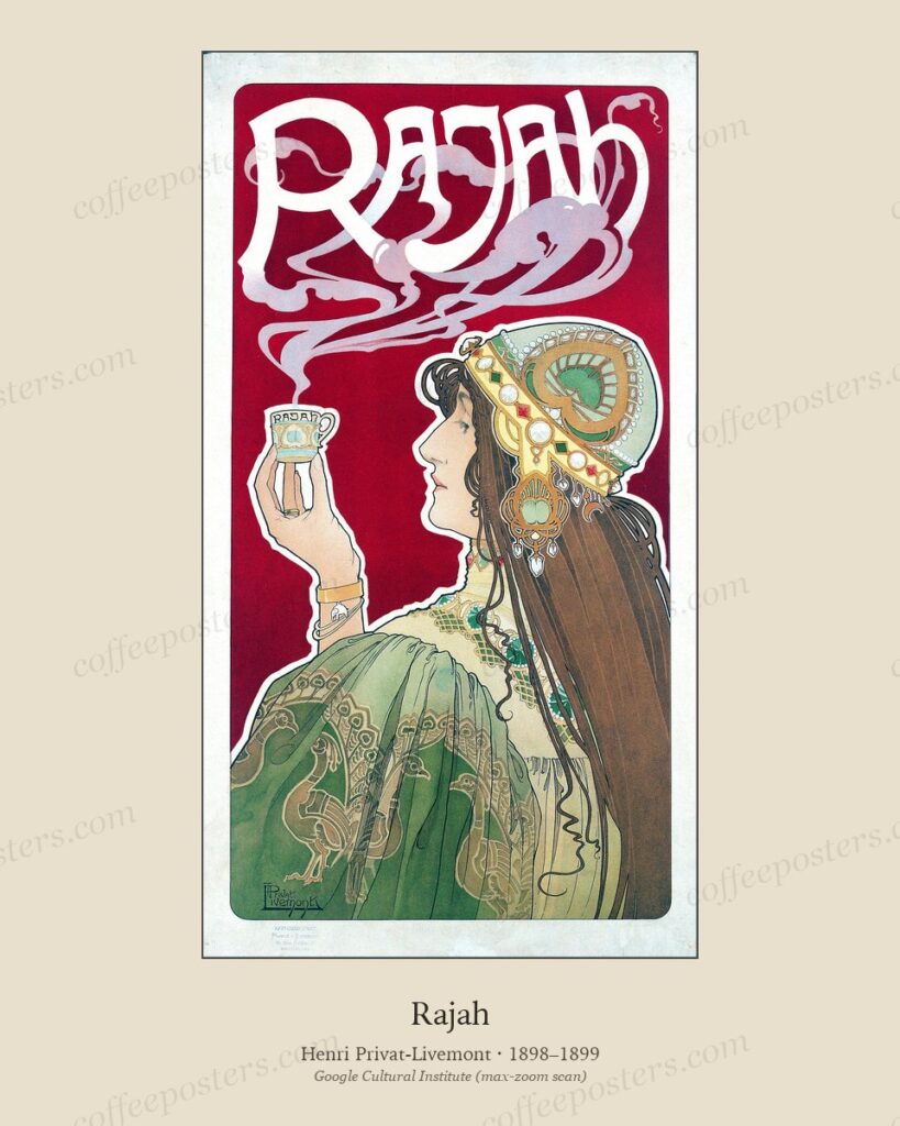
CA-001 deep dive: Privat-Livemont’s Rajah, 1898–1899
Henri Privat-Livemont’s Rajah is the canonical Belle Époque coffee poster: chromolithographed at the Goffin workshop in Brussels for a small Belgian colonial-import house, and the
Read →
The orientalist question in Belle Époque coffee advertising
An editorial position. Belle Époque coffee posters borrowed an exoticist visual register to sell beans grown in colonial territories. Why we include the work, why we don't romantic
Read →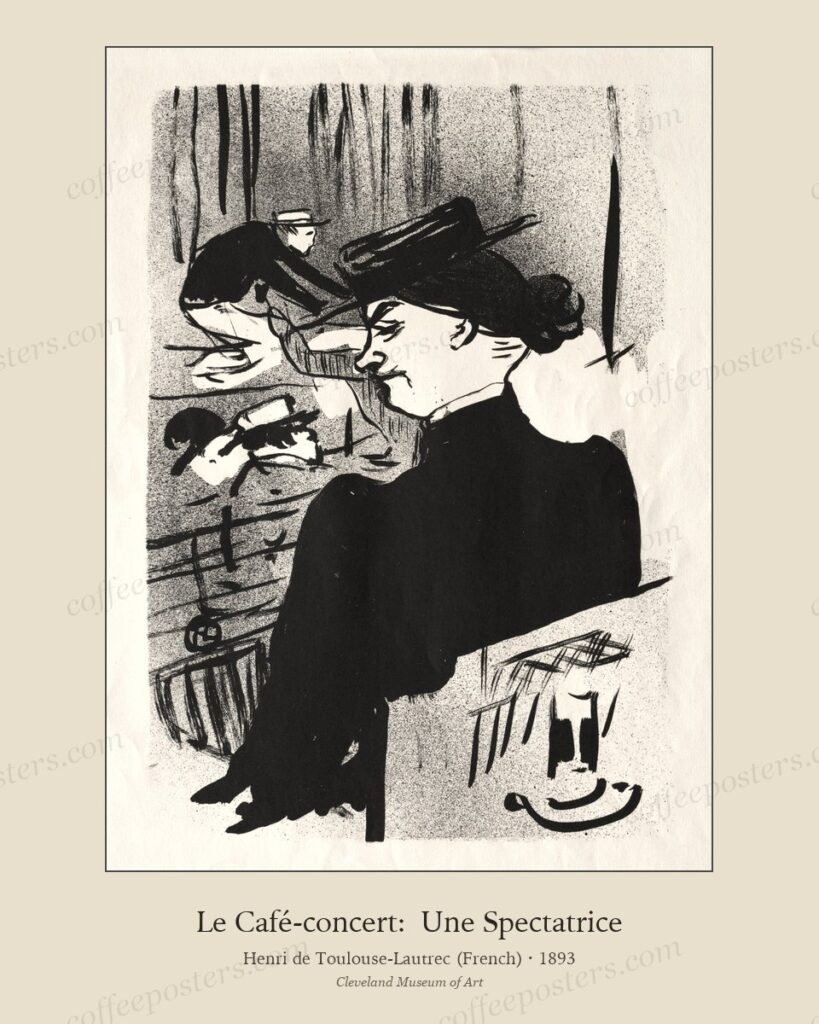
How to print and frame a coffee poster: a paper, mat, and frame walkthrough
A practical step-by-step on producing the actual physical print: paper choice, print shop, mat colour, frame stock, and the small decisions that separate a coffee poster that hangs
Read →
What ‘public domain’ means for coffee art today
What public-domain status actually grants the buyer, what we add on top through restoration and curation, and where the legal lines sit in 2026.
Read →
Ottoman coffeehouses in European travel lithography, 1820–1880
The 19th-century European travel artists who produced the visual record of Ottoman coffeehouses — what they got right, what they got wrong, and how to read the pictures honestly.
Read →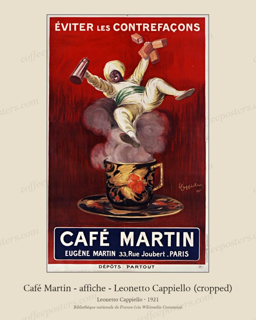
How chromolithography made the coffee poster possible
The technical history of the printing technology behind every Belle Époque coffee poster — chromolithography — explained from the workshop's side.
Read →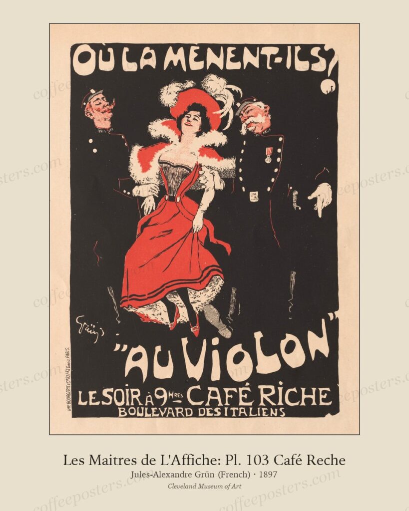
Where these images come from: a tour of the source institutions
The eight institutional sources that supply the archive, what each is strong on, and why the multi-source approach matters.
Read →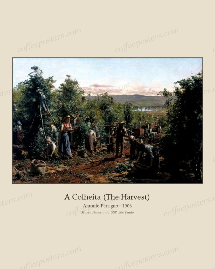
Brazilian fazenda paintings: Ferrigno, Norfini, and São Paulo’s coffee art, 1890–1920
The Italian-Brazilian painters who documented the São Paulo coffee plantations at the moment of peak production. Visually rich, historically dense, and uncomfortable in ways the ar
Read →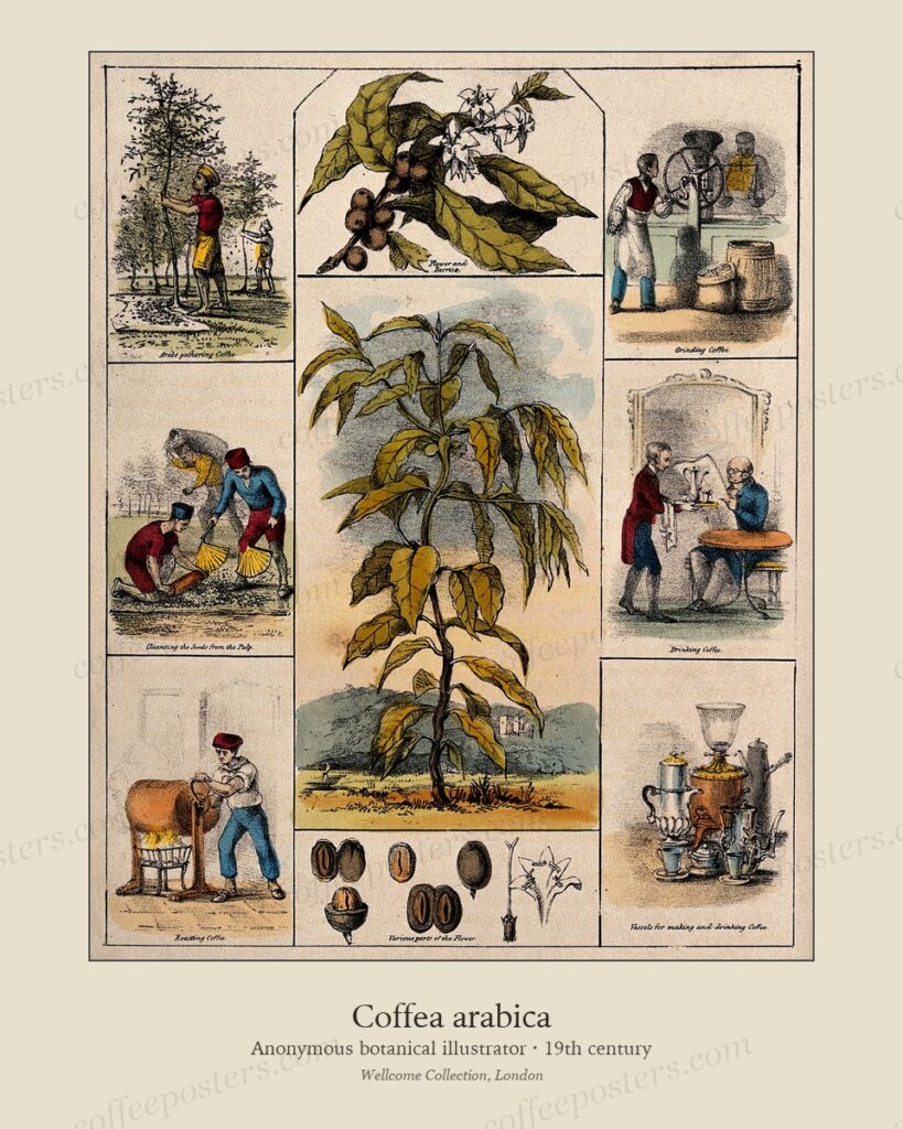
Coffea arabica in 19th-century botanical illustration
Where the botanical plates of the coffee plant come from — the scientific-illustration tradition, the engravers and lithographers who produced them, and what a real botanical plate
Read →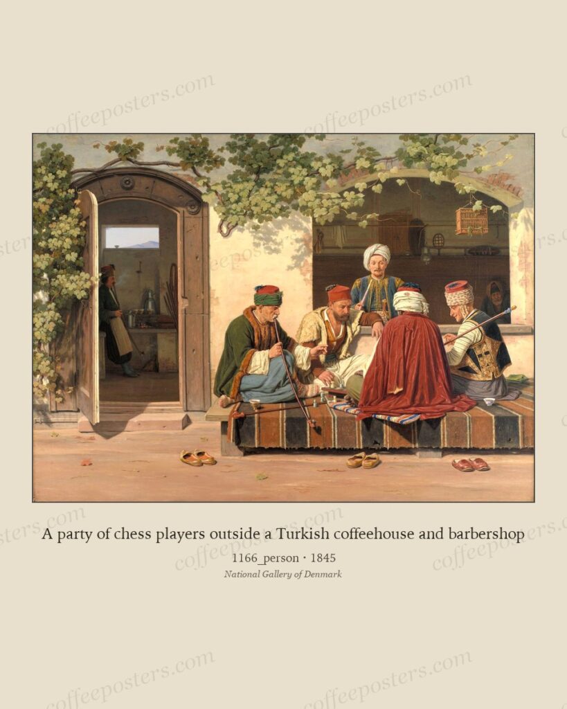
Why archival coffee posters belong on a cafe wall in 2026
A direct case for using real institutional archival material on specialty cafe interiors, instead of the mass-produced 'vintage coffee print' template that fills Etsy and Amazon.
Read →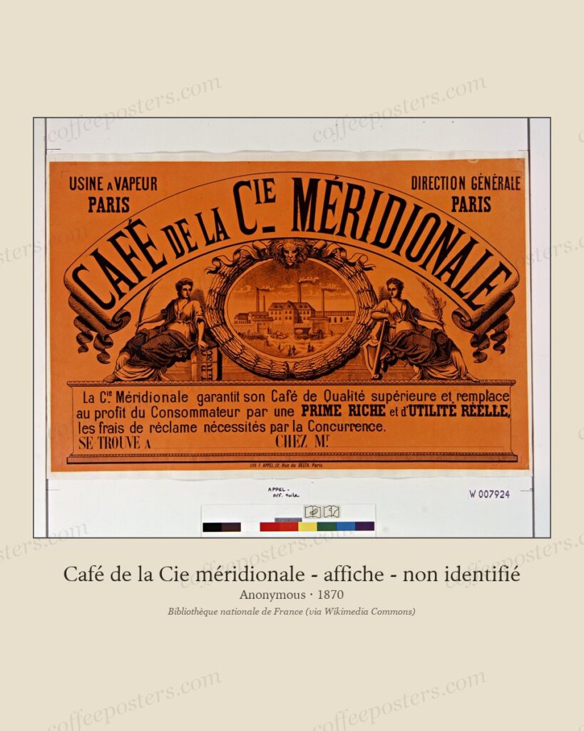
Henri Privat-Livemont and the Brussels print culture, 1895–1910
A short biography of the Belgian designer behind the canonical coffee Rajah, and the small Brussels print circle that produced most of the era's coffee, chocolate, and tobacco post
Read →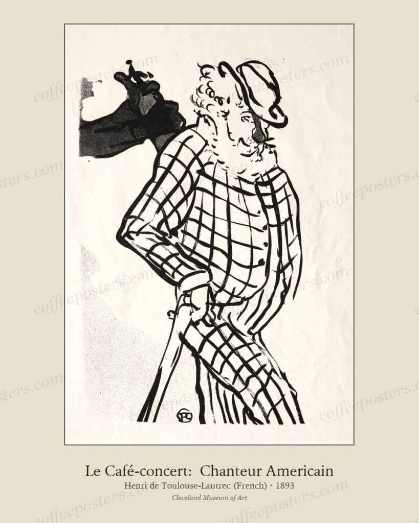
How to hang a Belle Époque coffee poster: paper, mat, frame
A short, opinionated guide to printing and framing a Belle Époque coffee poster so it reads the way it was designed to read.
Read →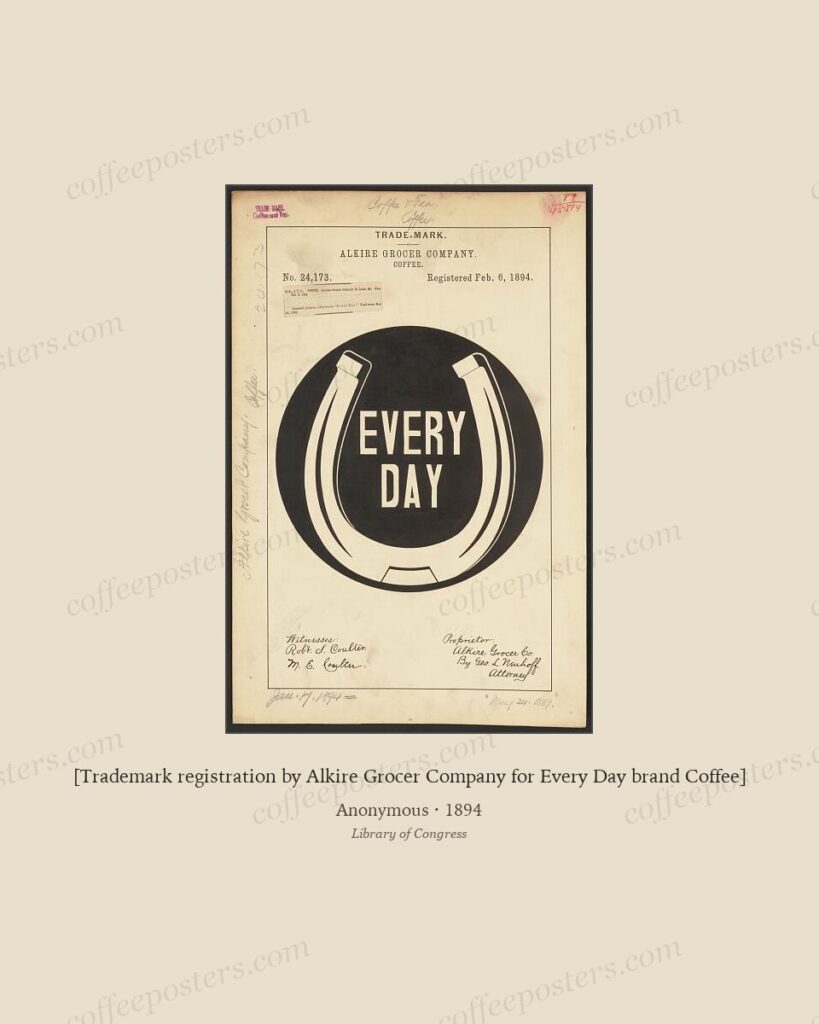
A short visual history of European coffee posters, 1885–1920
The thirty-five-year window from 1885 to 1920 produced almost every coffee poster anyone now thinks of as a 'vintage coffee poster.' This is the visual map of why.
Read →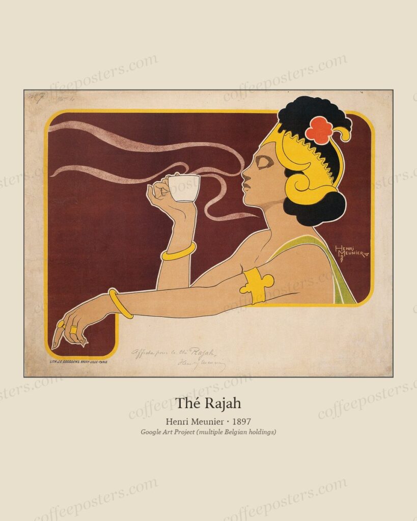
Two Rajahs: Privat-Livemont and Meunier in Brussels, 1897–1899
Two Belgian Art Nouveau posters share the name Rajah and belong to the same brand, but were designed two years apart by different artists. Both belong in this archive.
Read →Editorial questions — hello@coffeeposters.com