TL;DR — Between 1880 and 1930 coffee advertising moved through four visual phases: the ornamental Art Nouveau poster of the Belle Époque; the single-figure Cappiello-style brand hook of the 1900s; the geometric Art Deco design of the 1920s; and, running underneath all of them, the plainer trade-card and origin imagery of the American and colonial market. Reading a coffee advertisement’s visual language is usually enough to date it to within a decade.
By Coffee Posters · Published July 2026
1880–1900: the ornamental Belle Époque poster
The first great phase of coffee advertising is the Art Nouveau poster, made possible by the maturing of colour lithography. It is dense, decorative, and built around an idealised figure framed by ornamental borders — curling plants, whiplash lines, and an orientalist motif borrowed loosely from the coffee-growing East. The Brussels and Paris print circles produced most of the surviving examples, with Henri Privat-Livemont’s Belgian work as the canonical case.
This is coffee sold as pleasure and refinement, in the same visual language used for absinthe, chocolate, and tobacco. The image is busy and beautiful, meant to be lingered over on a Morris column or a café wall, and the brand name is often woven into the ornament rather than shouted.
1900–1915: the single-figure brand hook
Around 1900 the logic flips. Advertisers, led by Leonetto Cappiello, realised that a poster on a moving street has seconds to land, and the ornamental crowd gives way to a single arresting figure on a flat, usually dark ground. The image no longer depicts the product; it becomes the brand’s memory hook.
Coffee posters of this phase are simpler, higher-contrast, and far more legible at a distance. The shift tracks a change in the city itself — faster traffic, more competition for the eye — and it is the birth of modern brand advertising, applied to coffee among everything else.
1920–1930: Art Deco geometry
After the First World War the figure hardens into geometry. Art Deco coffee design — in the wake of the 1925 Paris Exposition des Arts Décoratifs and designers like A.M. Cassandre — favours stylised form, flat colour blocks, streamlined lettering, and a machine-age confidence. The curves of Art Nouveau are gone; the composition is built from angles and repeats, often with the new geometric sans-serif type integrated into the design. This is the last great phase of the drawn poster.
Underneath it all: trade cards and origin imagery
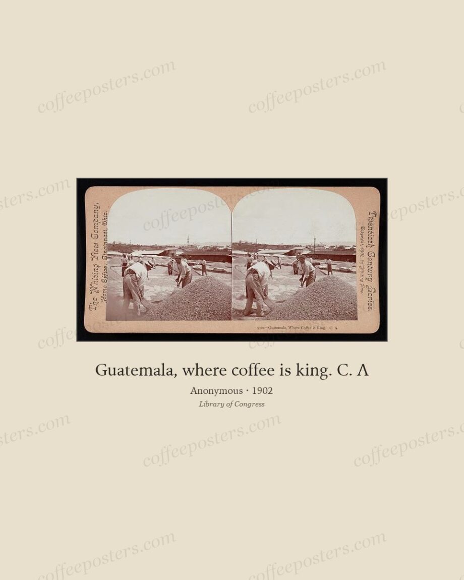
Running beneath the European poster tradition is a quieter, more numerous, more commercial stream: the American and colonial trade card, the brand label, and the origin scene. These sell coffee not with a Parisian figure but with a claim about where it comes from — a Guatemalan hillside, a Brazilian plantation, a caravan of beans, a Yemeni origin.
They are plainer, often anonymous, printed in the millions, and they document the mass market that the fine posters sat above. For a full picture of how coffee was sold, this stream matters as much as the famous affiches.
The end of the drawn image
Through the 1930s photography, photomontage, and cheaper offset printing displaced the hand-drawn poster, and the economic collapse after 1929 thinned the advertising trade. By the late 1930s the coffee advertisement was increasingly a photograph. The great age of the drawn coffee image — from the Belle Époque poster through Art Deco, roughly 1880 to 1935 — was over, which is exactly why the surviving work of those five decades reads as a distinct and finished tradition.
Dating a coffee advertisement by its look:
- Ornamental borders, curved lines, idealised figure — 1880–1900.
- One bold figure, flat dark ground, high contrast — 1900–1915.
- Geometry, flat colour blocks, streamlined type — 1920–1930.
- Plain trade card, origin or place-of-origin claim — throughout, mostly American/colonial.
In the archive: view the featured piece.
Frequently asked questions
How can I date a coffee poster by its look?
Ornamental borders and curved Art Nouveau lines point to 1880–1900; a single bold figure on a flat ground to 1900–1915; hard geometry and streamlined lettering to the 1920s.
Why do American coffee ads look so different from French ones?
The American and colonial market leaned on trade cards and origin imagery — selling where the coffee came from — rather than the figure-driven Parisian poster.
What ended the poster era?
Photography, photomontage, and cheaper offset printing from the 1930s, hastened by the economic collapse after 1929, replaced the drawn poster with the photographic advertisement.
Further reading
- How chromolithography made the coffee poster possible
- Chéret, Cappiello, and the French poster tradition
- Art Deco coffee design of the 1920s
Coffee Posters curates, restores, and reformats public-domain coffee visuals for archival-quality printing. Browse the archive · About.