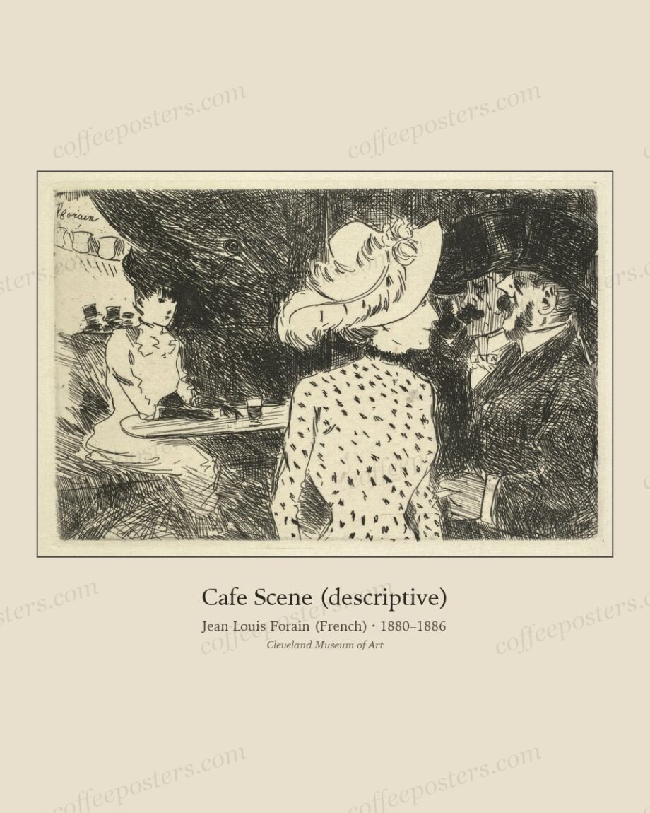
TL;DR — To make a mixed set of archival coffee pieces read as one collection, match the frames, not the images. One frame profile, one mat colour, one mat width across everything unifies different periods, media, and image sizes far more effectively than trying to match the artwork itself. The one allowed exception is a single statement piece in a heavier frame, hung apart.
By Coffee Posters · Published July 2026
Match the frame, not the art
The eye reads a repeated frame as intention. A Belle Époque poster, a botanical plate, and an Ottoman café lithograph have nothing in common as images — different centuries, palettes, and media — but put them in identical frames with identical mats and they instantly become a set. This is the single most useful rule in hanging a mixed archive.
Choose one profile and commit. A thin matte-black frame is the safe universal default; a warm oak or walnut suits period paper and reads a little softer. Avoid ornate gilt for a whole wall — it fights busy images and dates quickly — unless the pieces are uniformly formal.
Keep the mat constant
Use the same mat colour and the same border width on every piece. A warm off-white or cream flatters aged-paper tones far better than bright white, which reads cold and modern against 19th-century work. A 5–8 cm mat is a reliable middle. The one time to vary mat width is to bring different image sizes to a common outer frame size, so the frames themselves stay uniform.
Handling different image sizes
Archival pieces rarely share proportions. The trick is to standardise the outer frame size, not the image: a smaller print gets a wider mat, a larger one a narrower mat, so every framed object is the same overall dimension. A grid of identical outer sizes reads as intentional even when the images inside vary widely.
The one allowed exception
A single deliberate exception works and can lift a wall: one statement piece — the largest or most striking image — in a heavier or gilt frame, hung apart from the grid, reads as a focal point. Two or more exceptions read as indecision. Keep the rule; break it once, on purpose.
Glazing and consistency
Finish the consistency at the glass. Use the same glazing across the set — anti-reflective on any wall facing a window, standard elsewhere — and the same orientation logic. Small consistencies (matching hardware, level bottom lines, equal gaps) are what separate a collection from an accumulation.
In the archive: view the featured piece.
Frequently asked questions
Do all my coffee prints need the same frame?
For a grouped wall, yes — a single repeated frame profile and mat is what unifies mixed periods. Standalone pieces in different rooms can differ.
What mat colour works for vintage coffee art?
A warm off-white or cream, which flatters aged paper. Bright white reads cold and modern against 19th-century artwork.
How do I frame prints of different sizes together?
Standardise the outer frame size, not the image: give smaller prints wider mats and larger prints narrower mats, so every framed piece is the same overall dimension.
Further reading
- How to print and frame a coffee poster
- Why archival coffee posters beat generic vintage
- Designing a specialty cafe interior
Coffee Posters curates, restores, and reformats public-domain coffee visuals for archival-quality printing. Browse the archive · About.