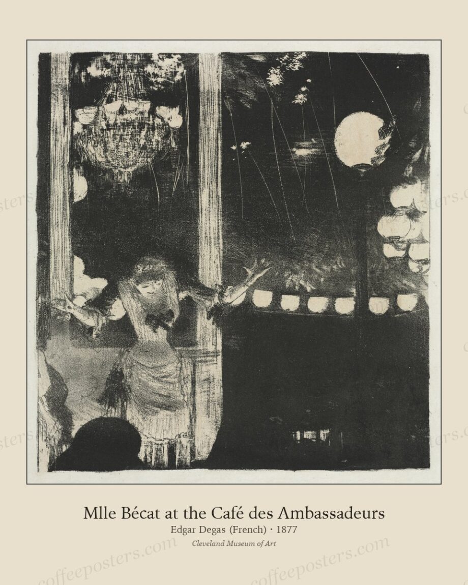
TL;DR — Restaurants and cafés draw from the same archive differently. A café is coffee-forward with close seating, so it favours coffee posters and café-scene imagery, denser and hung low to a seated sightline. A restaurant is read across a room and across a meal, so it favours fewer, larger, quieter statement pieces — landscapes, origin scenes, still lifes — in restrained frames hung a little higher.
By Coffee Posters · Published September 2026
Cafés: posters and café scenes, dense and low
A café is a coffee-forward room with close seating and quick turnover, and the art can be denser and more numerous to match. Belle Époque coffee posters and café-concert scenes belong here: they are on-subject, they carry colour and energy, and they reward the close viewing that café seating allows. Hang them to a seated sightline, 140–145 cm to centre, and a grid or gallery arrangement suits the busy, sociable register.
The café can also afford to be playful and specific — a wall of Parisian café affiches, a set of Ottoman coffeehouse lithographs — because customers are close enough to read the detail and stay long enough to enjoy it.
Restaurants: fewer, larger, quieter
A restaurant is read from across a dining room and over the length of a meal, and it wants a calmer register. Fewer, larger statement pieces — a plantation landscape, an origin scene, a domestic still life, a single monumental poster — read better at distance and don’t fatigue over a two-hour dinner. Hang them a little higher, in restrained frames, with more wall around each.
The restaurant’s art is scenography, not conversation: it sets a mood the diner absorbs rather than studies. Quiet, large, and confident beats busy and numerous.
Why the same archive splits
The difference is density and scale, not taste. A café-concert scene that delights at arm’s length in a café becomes fussy across a restaurant floor; a large plantation landscape that anchors a dining room looks sparse on a tight café wall. Match the piece’s viewing distance and the room’s dwell time, and the same archive serves both.
What both share
Both reward a single consistent frame system and deliberate, warm lighting, and both are better served by real archival pieces than by generic hospitality stock. The shared rule is provenance: a named artist and a date give staff a story and give the room authority, whether it’s a three-piece restaurant wall or a twelve-piece café grid.
In the archive: view the featured piece.
Frequently asked questions
Is café art different from restaurant art?
Same archive, different use: cafés go denser with posters and café scenes at a seated height; restaurants go fewer, larger, and quieter with landscapes and still lifes hung higher.
What art suits a restaurant dining room?
Fewer, larger statement pieces — plantation landscapes, origin scenes, still lifes, a monumental poster — that read from across the room and don’t fatigue over a long meal.
Why not use the same wall approach for both?
Viewing distance and dwell time differ. A busy café grid reads as fussy across a restaurant floor; a sparse restaurant hang looks thin on a tight café wall.
Further reading
- How to print and frame a coffee poster
- Why archival coffee posters beat generic vintage
- Designing a specialty cafe interior
Coffee Posters curates, restores, and reformats public-domain coffee visuals for archival-quality printing. Browse the archive · About.