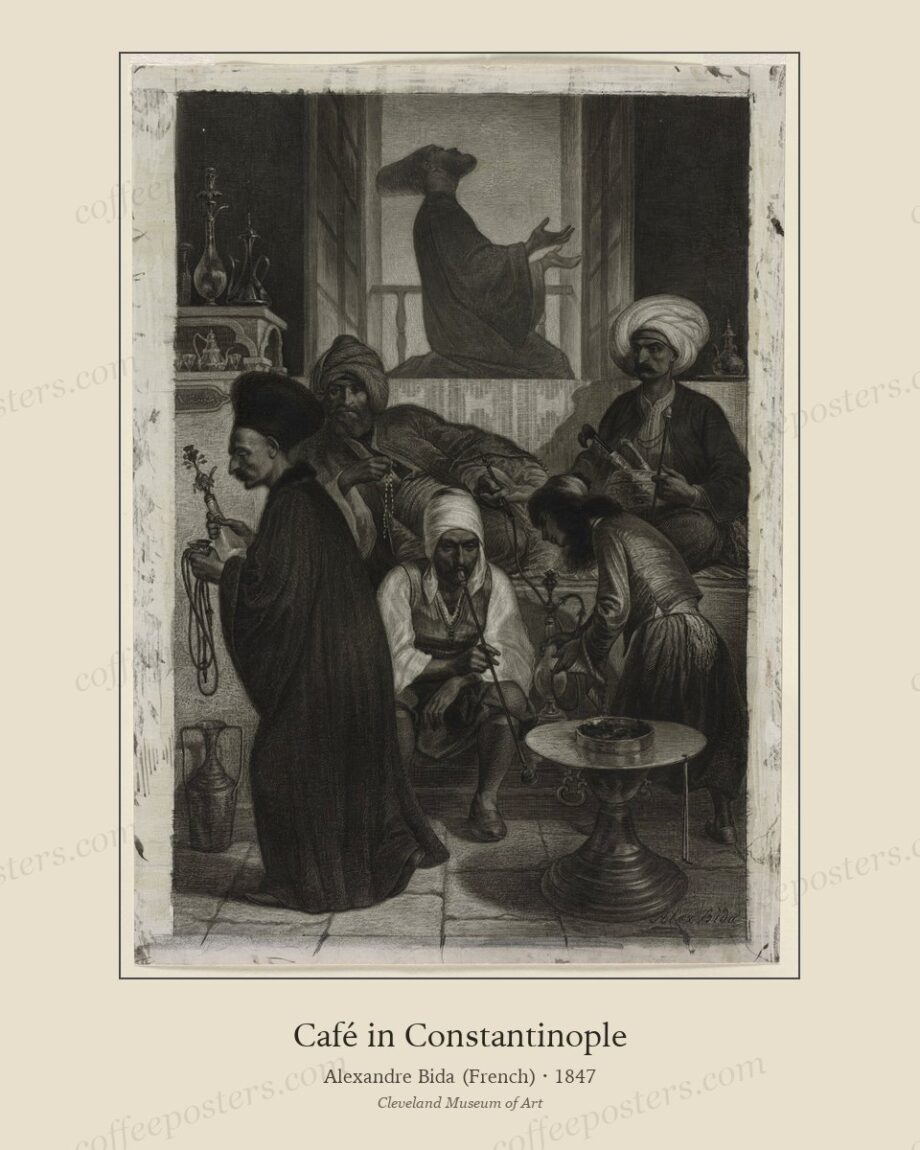
TL;DR — Five mistakes ruin most café walls: hanging too high, mismatched frames, too many sizes, generic stock art, and poor lighting. Each has a cheap fix that is about discipline rather than budget, and correcting all five turns a themed wall into a curated one.
By Coffee Posters · Published August 2026
Mistake 1: hanging too high
The most common error. Gallery advice says 150 cm to centre, but café audiences are seated, so the art floats above the eye line and disconnects from the room. Drop the centre to 140–145 cm and the whole wall suddenly relates to the tables beneath it.
Mistake 2: mismatched frames
A wall of good images in a jumble of different frames reads as an accumulation, not a collection. One frame profile and one mat colour across the whole wall is the single highest-impact fix available, and it costs nothing extra to specify at the framing stage.
Mistake 3: too many sizes
A scatter of mixed sizes at random reads as a flea market. Either use one size in a clean grid, or anchor a deliberate arrangement around a single largest piece with the rest balanced and the block’s outer edges kept square. Commit to a system; don’t improvise.
Mistake 4: generic stock art
The burlap-sack-and-twine photography and “but first, coffee” typography quietly contradict the care a specialty café signals with its coffee. Real archival pieces — a named artist, a date, a printing history — reinforce that message instead of undercutting it, and give staff a story to tell.
Mistake 5: bad lighting
Even a perfect wall fails under glare or flat, cold light. Light the wall deliberately, from an angle rather than head-on; use anti-reflective glazing opposite windows; and choose warm-white light (2700–3000K) so aged paper and period palettes read warm rather than grey.
The fix, in one line
Hang lower, frame the same, size deliberately, buy real, and light it properly. None of these costs much; all of them are decisions, not expenses.
In the archive: view the featured piece.
Frequently asked questions
What is the most common café wall mistake?
Hanging too high. Café audiences are seated, so the centre line should sit at 140–145 cm, lower than a standing gallery hang.
Why avoid generic coffee posters in a specialty café?
They quietly contradict the care your coffee signals. Archival pieces with a named artist and date reinforce it and give staff a story to tell.
What lighting is best for café art?
Angled (not head-on) warm-white light at 2700–3000K, with anti-reflective glazing opposite windows, so period paper reads warm and glare-free.
Further reading
- How to print and frame a coffee poster
- Why archival coffee posters beat generic vintage
- Designing a specialty cafe interior
Coffee Posters curates, restores, and reformats public-domain coffee visuals for archival-quality printing. Browse the archive · About.