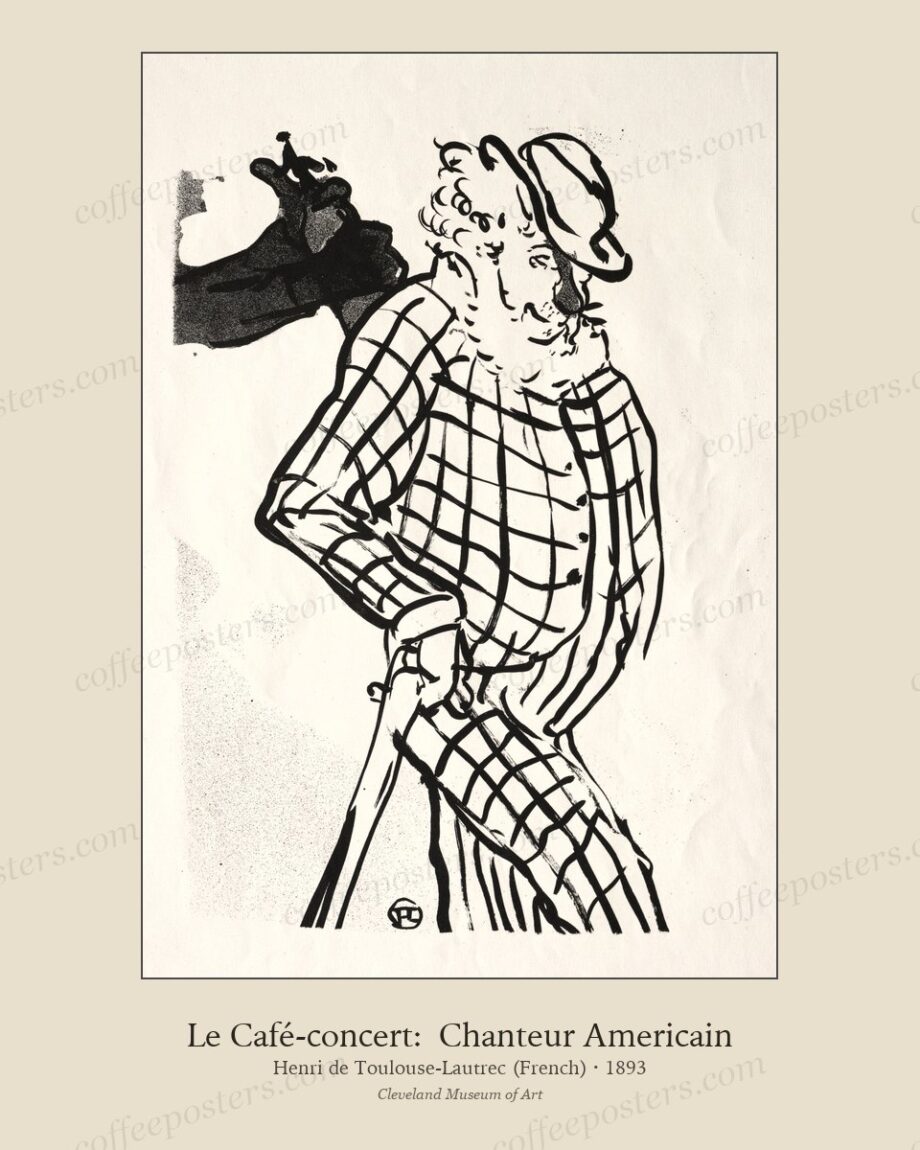
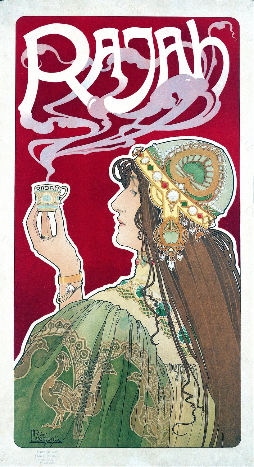
A Belle Époque coffee poster was designed to be read at standing-figure height across a Parisian boulevard. Most of the contemporary mistakes we see — small print, gloss paper, modern aluminium frame, white-cream mat — undo that design choice. Here is the short opinionated version of how to print and frame one of these pieces so it reads the way it was designed to read.
Size
Print large or don’t print at all. The Belle Époque coffee posters in this archive — Privat-Livemont, Meunier, Cappiello, the period Italians — were designed for full-poster scale, roughly 100 × 50 cm in their original Goffin or Chaix printings. At 8 × 10 inches the figure shrinks below recognition and the ornamental border swallows it. At 16 × 20 inches the piece begins to work. At 20 × 30 inches and up it reads correctly.
If wall space forces a smaller hang, pick a non-poster piece from the archive instead — a botanical plate, a domestic-genre print, a small lithograph. Those work small. Belle Époque posters don’t.
Paper
Matte fine-art paper. Cotton rag if possible. Hahnemühle Photo Rag, Canson Aquarelle Rag, Moab Entrada, or any comparable matte cotton-rag stock from a fine-art print shop.
Gloss paper is the most common mistake. Chromolithography never had a gloss surface — the original prints sat on a matte coated paper with a slight texture. Gloss reads as photographic and modern; it flattens the lithographic palette and adds a reflective surface the original never had. The piece reads wrong.
If your local print shop only offers gloss for large format, find a different shop. The fine-art print shops in any mid-sized city have matte cotton-rag in stock. They charge $30–$90 for a 16 × 20 print depending on city. Worth the difference.
Mat
A wide mat, 6 to 10 cm depending on print size. Use a cream, off-white, or warm-grey mat — never pure white. The Belle Époque palette includes the studio’s choice of paper warmth as part of the composition; pure white mats fight that. Cream and warm-grey work with it.
If the piece will hang in a café or commercial space, consider a slightly wider mat than you would at home — 10 to 15 cm. The visual breathing room reads as deliberate; it tells the buyer the piece was chosen, not just bought.
Frame
Slim warm-toned wood. Oak, walnut, ash, or a darker stained wood. Frame width 1.5 to 3 cm. Glass over the print is fine; UV-protective glass is worth the upcharge if the piece will hang in daylight.
What not to do:
- No modern aluminium frames. They read as architectural specification, not as poster.
- No wide gallery-black wood. The Belle Époque palette doesn’t carry that much black; a heavy black frame turns the poster into a shape rather than an object.
- No ornate gilded frames. The Belle Époque was already ornate in its compositional border; an ornate frame doubles it.
If the budget allows, look at thrift stores, estate sales, and Facebook Marketplace for antique frames. A real 19th- or early-20th-century wooden frame paired with a Belle Époque print reads as if the piece itself has been hanging there for a hundred years. A good frame shop will cut new glass and mount the print into a vintage frame for $25–$60.
Where to hang
Eye level for the focal element of the composition. For most Belle Époque coffee posters that focal element is a face or a hand, and the right hang height puts that face roughly 150 cm from the floor — a touch lower than the standard American hang at 160 cm. The pieces were designed to be read at standing-figure height, not at gallery height.
If the piece will hang in a café behind a bar, raise it 10 to 20 cm above standard eye level — the bar height puts the customer’s eye at standing-walking height, which is higher than the home seated-standing average.
One piece or a wall
A single 16 × 20 inch Belle Époque poster carries a wall on its own if the wall is between 1.5 and 3 metres wide. For larger walls, group three to five pieces in a horizontal row at matched heights — same period, same printer if possible, same mat colour, same frame stock. The grouping reads as a curated archive rather than a decoration.
Avoid mixing the Belle Époque posters with non-coffee period material. They look strongest paired with each other or with period botanical plates and domestic-genre prints from the same window.
In the archive
- Browse all coffee posters
- Browse Belle Époque coffee art
- Generic print & frame guide — for non-poster pieces