![[Trademark registration by Alkire Grocer Company for Every Day brand Coffee]](https://coffeeposters.com/wp-content/uploads/2026/06/CA-726-920x1150.jpg)
Almost every coffee poster that contemporary buyers recognize as “vintage” — the large-format colored lithographs that hang behind espresso bars, in third-wave roasteries, and in coffee-themed home offices — was made in a thirty-five-year window between roughly 1885 and 1920. Before 1885 the technology did not exist. After 1920 the commercial register shifted. This is the short visual map of why.
1885: chromolithography becomes affordable
The technical precondition for the Belle Époque coffee poster was the maturation of chromolithography — color printing from multiple limestone plates, one per color, with each plate hand-registered to the others. The process had existed since the 1830s in luxury form, but it became affordable enough for commercial advertising work only in the mid-1880s, when steam-powered presses and standardized stone sizes brought per-print costs down to a level that small brands could afford. The Goffin workshop in Brussels, the Imprimerie Chaix in Paris, and the Ricordi works in Milan emerged as the dominant continental commercial-poster printers in this window.
What this meant for coffee, tea, and chocolate brands was simple: between 1885 and 1890, for the first time, a small importer could commission a four- or six-color poster from a known designer for a price that was competitive with newspaper advertising. The race to commission the most striking poster began.
1885–1900: the orientalist phase
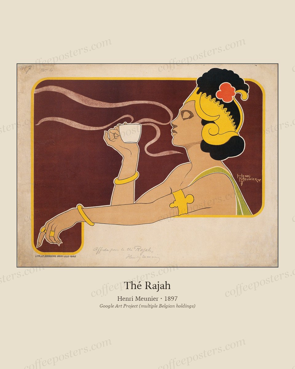
The first wave of commercial coffee posters drew on the visual vocabulary of European travel painting and Salon orientalism. Turbaned figures, jewel-toned palettes, half-invented ornamental flora, and the standard repertoire of Levantine signifiers ran through the work of Jules Chéret, Henri Meunier, the Belgian Privat-Livemont, and the early French Art Nouveau designers. Most of these posters sold coffee, tea, or chocolate by associating the product with what European buyers understood as “the source” — even though much of the imagery had no relationship to the actual territories where the beans grew.
This is the period we include in the archive because the visual document is real. It is also the period whose framing we have to name honestly. The buyer looking at one of these posters in 1898 was being sold a fantasy of origin; the buyer looking at one of these posters in 2026 is looking at a hundred-and-twenty-five-year-old document of European commercial imagination. Both readings are correct.
1895–1910: the Art Nouveau peak
The middle of this window is when the most graphically refined coffee posters were made. Privat-Livemont’s mature work, Mucha’s coffee-adjacent commissions, the Steinlen Chat Noir programs that ran in coffee-and-absinthe rooms across Montmartre, the German Jugendstil response in Munich and Vienna — all of this work happens between roughly 1895 and 1910. The compositions are tighter, the typography is integrated rather than added, and the printers had a decade of practice with the four- and six-color separation.
This is the period the contemporary specialty-coffee aesthetic most often reaches for, because it is the period whose visual register reads most cleanly today: clean lines, decisive color, single-subject composition, and an absence of the typographic noise that fills earlier 19th-century commercial print.
1910–1914: late Belle Époque, last great commissions
The four years before the First World War saw the last great wave of Belle Époque commercial commissions. Cappiello in France, Hohlwein in Munich, and a handful of smaller designers across Belgium and Italy produced what would turn out to be the closing statements of the chromolithographic poster era for coffee, tea, and tobacco. The work from this window is sharper than the 1895–1910 peak — bolder color blocks, faster reading — and presages the design language that would emerge after the war.
1914–1918: the war interrupts
The First World War effectively halted commercial poster production for coffee. The print workshops were repurposed for war propaganda. The brand budgets disappeared. A handful of Italian and Spanish coffee commissions kept going through 1916 and 1917, but the great Belgian and French houses largely stopped commissioning new work until 1919.
1919–1920: the bridge to Art Deco
The first years after the war saw a short transitional period in coffee advertising. The pre-war chromolithographic process still existed; the post-war designers (Cassandre in his very early work, the Italian futurists who survived the war, the German modernists in Berlin) were already moving toward what would become Art Deco. The 1919–1920 coffee posters that survive sit between two visual worlds — still chromolithographic, no longer Belle Époque.
After 1920, coffee poster design enters its Art Deco phase. That is a different essay.
How to read a Belle Époque coffee poster today
Three things to look for when picking a piece from this window:
- The printer’s mark. Most Belle Époque coffee posters carry the print workshop’s mark in the lower margin — Goffin in Brussels, Chaix in Paris, Ricordi in Milan. The mark is documentary; it tells you where the piece was actually made.
- The orientalist register. Read it as period, not as endorsement. The pieces are documents of how European commerce visualized its sources, not records of the sources themselves. If a piece’s framing makes you uncomfortable, that is the right response; the historical work continues anyway.
- The composition’s readability at distance. Posters from this era were designed to be read across the width of a Parisian boulevard. They print well at large format because they were designed for it. A Belle Époque coffee poster at 8 × 10 inches loses most of what makes it work; at 16 × 20 inches and up, it reads correctly.
In the archive
- Browse Belle Époque coffee art — the full set of pieces from this window
- Browse Art Nouveau coffee posters
- All posters in the archive