TL;DR — A specialty café interior built on archival coffee art reads as curated rather than themed when it follows three rules: choose pieces that share a period, a place, or a printing technique; frame them as one consistent set; and hang them to a seated sightline. The art then does the same job a good house blend does — it signals that someone made deliberate choices. This is a working guide to making those choices.
By Coffee Posters · Published June 2026
Start from one organising idea, not a mood
The most common mistake in a café fit-out is decorating to a mood — “vintage,” “cosy,” “European” — and buying whatever fits the feeling. The result is a wall that looks bought, not curated. The fix is to decide on a single organising idea before you choose a single piece. An organising idea is concrete and testable: Belle Époque coffee advertising, the coffeehouse as a painted subject, the journey from plantation to cup. Once you have one, every candidate either belongs or it doesn’t, and the wall composes itself.
The idea also gives you a story to tell staff and customers, which is half the value of real archival art in a hospitality space. “These are Brussels coffee posters from the 1890s” is a better line than “we liked the colours.”
Three organising ideas that fit a café
Three ideas work especially well because they map onto how the room is already used and onto how the archive is already divided.
Frame as a set, even when the pieces aren’t
The fastest way to make mismatched periods read as one collection is to frame them identically. A consistent frame profile and mat colour across the whole wall does more visual work than any attempt to match the images themselves. Pick one frame — a thin matte-black or a warm-oak profile is safe in almost any café — and one mat width, and apply it to everything. The eye reads the repeated frame as intention.
For a commercial space the practical spec is simple: heavyweight matte paper, a 5–8 cm off-white mat, and anti-glare glazing on any wall that faces a window. Our print-and-frame walkthrough covers stock weight, finish, and glazing in detail.
Hang to a seated sightline
In a café the relevant sightline is the seated customer’s eye level, which is lower than a standing gallery hang. Centre the pieces around 140–145 cm from the floor rather than the gallery-standard 150 cm, and the wall will read correctly to people at tables. Keep a constant 5–8 cm gap for a tight grid, more if the pieces are large. A grid of equal-sized frames reads as deliberate; a scatter of mixed sizes reads as a flea market unless you are very confident.
Match the piece to the wall’s job
Different walls do different work. The counter or espresso-bar wall wants one large statement piece at eye level above the machine. The seating wall wants a grid of four to nine equal frames centred low. A corridor wants a single steady horizontal row. A window-front wall wants darker, higher-contrast images that survive backlight. Decide each wall’s job before you choose its art.
Why archival beats generic here
A specialty café makes a claim about care and provenance with every cup, and generic mass-market coffee art — the burlap-sack stock photography, the “but first, coffee” typography — quietly contradicts that claim. Real archival pieces, with a named artist, a date, and a printing history, make the same argument the menu does. The full reasoning is in our note on why archival coffee posters beat generic vintage.
Three organising ideas that reliably work:
- One period — everything from a single era (say 1885–1915), so typography, palette, and printing technique already rhyme. Draw from the poster category.
- One subject — coffeehouses and café scenes across periods and countries, from the café-scenes category.
- One arc — bean to cup: a botanical plate, a plantation landscape, a roasting engraving, a drinking scene. Four pieces that tell a sequence.
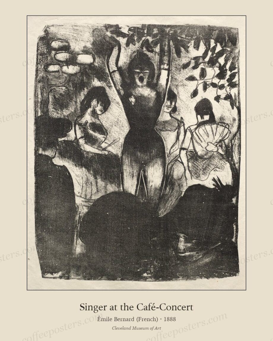
A good starting piece: Singer at the Café-Concert, which reads well above a seating banquette.
Frequently asked questions
How many pieces should a small café hang?
For a small room, one statement piece plus a grid of four reads as curated without crowding. More than nine frames on one wall starts to need a designer’s eye to stay coherent.
Do the frames have to match exactly?
The frames should match; the images do not. A single repeated frame profile and mat is what makes a mixed-period set read as one collection.
How high should café art be hung?
Centre it around 140–145 cm, lower than the gallery-standard 150 cm, because the audience is seated at tables.
Further reading
- How to print and frame a coffee poster
- Why archival coffee posters beat generic vintage
- Hanging a 12-piece café wall
Coffee Posters curates, restores, and reformats public-domain coffee visuals for archival-quality printing. Browse the archive · About.