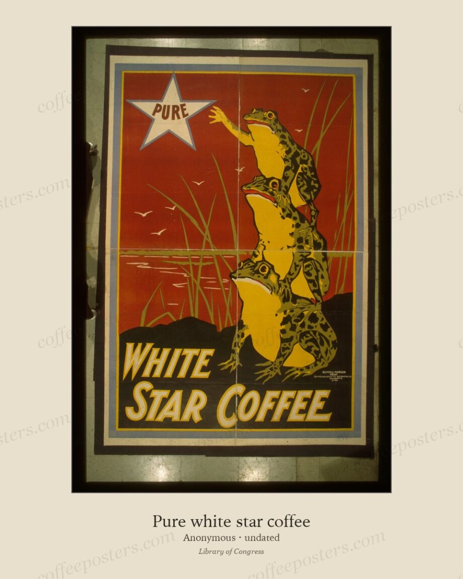
TL;DR — Jugendstil — the German-language form of Art Nouveau, centred on Munich and named after the Munich weekly Jugend (founded 1896) — gave coffee and beverage advertising a flatter, bolder, more graphic look than the busy floral ornament of Brussels and Paris. Designers around the Munich and Vienna workshops pushed toward flat colour and strong contour, pointing directly at the reductive poster style of the 1910s.
By Coffee Posters · Published July 2026
Munich and the magazine Jugend
Jugendstil takes its name from Jugend (“Youth”), the illustrated Munich weekly launched in 1896 that became the movement’s shop window. Munich, not Paris, was its centre, and its designers — working for magazines, breweries, and consumer brands — favoured flat areas of colour, a firm dark contour, and a graphic clarity quite different from the tangled organic line of the Belgian and French work of the same years.
The related Vienna Secession, formed in 1897 under Gustav Klimt, and the Wiener Werkstätte (1903) pushed the same instincts further toward geometry and pattern. Together they form the German-Austrian branch of Art Nouveau, and the coffee-house cultures of Munich, Vienna, and Berlin were among their natural markets.
A harder line
Where Privat-Livemont’s Brussels line curls and fills every corner, the Jugendstil line simplifies and flattens. A German coffee or chocolate poster of around 1900 is more likely to reduce the subject to a few bold shapes, a strong silhouette, and a limited palette — reading as more modern and more poster-like, and anticipating the reductive advertising of the following decade. The lettering, too, tends toward the designed and integrated rather than the decorative afterthought.
Why it matters for coffee
Germany and Austria were major coffee-consuming markets, and the Kaffeehaus was a central social institution, especially in Vienna. The Jugendstil poster is how those brands and houses looked at the turn of the century — a distinct national dialect of the Belle Époque coffee image, cooler and more graphic than its Western neighbours.
From Jugendstil to the modern poster
The flatness and contour of Jugendstil fed directly into the Berlin Sachplakat (“object poster”) pioneered by Lucian Bernhard around 1906 — a radical reduction to the product, its name, and a flat ground, with everything else stripped away. That line of development, from Munich’s Jugendstil to Bernhard’s object poster, is one of the roads by which advertising moved from ornament to the clean modern sign.
In the archive: view the featured piece.
Frequently asked questions
What is Jugendstil?
The German and Austrian form of Art Nouveau, centred on Munich and named after the weekly Jugend (1896), with flatter colour and a bolder, more graphic line than the French and Belgian work.
How do German coffee posters differ from French ones?
They tend to be flatter, stronger in outline, and less floral — more graphic and poster-like than the busy Paris and Brussels ornament, pointing toward the reductive object poster of the 1910s.
What came after Jugendstil?
The Berlin object poster (Sachplakat) of Lucian Bernhard around 1906, which stripped the advertisement down to the product, its name, and a flat ground.
Further reading
- How chromolithography made the coffee poster possible
- Privat-Livemont and the Brussels print culture
- Chéret, Cappiello, and the French poster tradition
Coffee Posters curates, restores, and reformats public-domain coffee visuals for archival-quality printing. Browse the archive · About.