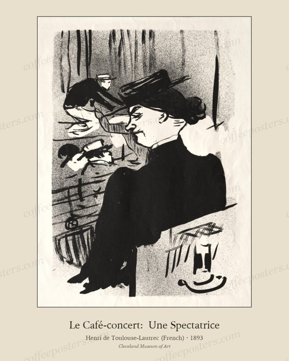
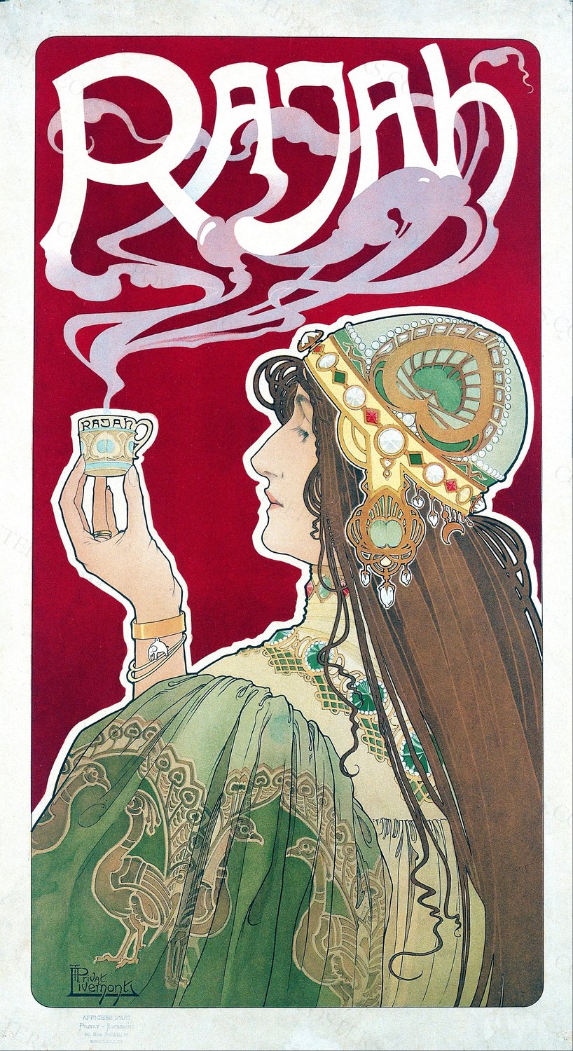
You bought the file. Now you need to turn it into a physical print on a wall. This is the step-by-step walkthrough — what to ask the print shop, what paper to insist on, what mat colour to pick, what frame to put on, and the small decisions that separate a coffee poster that hangs well from one that looks home-printed.
Step 1: pick the size
The download includes three sizes — 8×10, 11×14, 16×20 inches. For a Belle Époque coffee poster (Rajah, Meunier, Cappiello), use 16×20 minimum. The figural detail collapses below that. For a botanical plate or smaller cafe-scene piece, 11×14 works. For a piece going on a small home wall section, 8×10 is fine.
The rule: pick the largest size your wall can comfortably hold without the print dominating. Coffee posters were designed for boulevard scale; they reward room scale, not desktop scale.
Step 2: pick the print shop
Three tiers, all valid, ranked by price:
Walgreens or CVS photo lab. $5–15 per print depending on size. Good enough for casual home use; not the right call for a cafe interior or a piece you intend to live with for years.
Mid-market fine-art print shop or online service. Mpix, ProDPI, Whitewall, or any local print shop with cotton-rag paper stock. $25–60 per print depending on size. This is the right tier for serious home or small cafe use.
High-end giclée specialist. Local fine-art print studio, archival paper, custom proofing. $80–200 per print. Use for the piece anchoring a commercial cafe interior or a museum-grade home display.
Most buyers should pick tier two. The visible difference between tier two and tier three at normal viewing distance is small; the difference between tier one and tier two is large.
Step 3: insist on matte cotton-rag paper
This is the single most important decision and the one most buyers get wrong.
The default at most consumer print shops is glossy or semi-gloss photo paper. Don’t use it for coffee posters. Glossy paper makes the print look like a photograph, which a Belle Époque chromolithograph emphatically was not. The original prints were made on matte coated stock with a slight texture; glossy paper destroys the surface character.
Insist on:
- Hahnemühle Photo Rag (the industry standard for fine-art reproduction)
- Canson Aquarelle Rag or Canson Rag Photographique
- Moab Entrada
- Any 100% cotton rag paper with a matte finish
If the print shop doesn’t have any of these in stock, walk away. A real fine-art shop has cotton rag on hand.
Step 4: pick the mat
The mat (the framed border around the print) is structural — it provides visual breathing room and physical separation between the print surface and the glass.
Width: 6–10 cm (2.5–4 inches) for an 11×14 or 16×20 print. Wider for larger prints. Narrower mats read as DIY; wider mats read as deliberate.
Colour: cream, warm white, or warm grey. Never pure white. Pure-white mats fight the warm tonal palette of period chromolithographs. The Belle Époque palette is built on cream paper warmth as part of the composition; the mat should continue that warmth.
Material: acid-free cotton rag mat board if archival storage matters; standard cardboard mat is fine for most home use. The difference is whether the mat will yellow over 20 years.
Step 5: pick the frame
Two safe paths and one creative one.
Safe path A: slim warm wood. Oak, walnut, or ash. Frame width 1.5–3 cm. This is the right default for a Belle Époque coffee poster.
Safe path B: slim dark wood. Stained walnut, dark oak, or black-stained wood at 2–3 cm width. Use for botanical plates or pieces with a strong dark background.
Creative path: period-appropriate antique frame. Estate sales, antique shops, and Facebook Marketplace are full of 19th and early-20th century wooden frames at $20–100. Have a local frame shop cut new glass and mount the print into the antique frame. The result reads as if the piece has been on the wall for a hundred years. This is the highest-impact choice and the cheapest.
What to avoid:
- Modern aluminium frames — they read as architectural specification, not as poster
- Heavy gallery-black wood frames at 5+ cm width — the black weight crowds the Belle Époque palette
- Ornate gilded frames — the original poster already has ornate gold; doubling it is too much
Step 6: hang at the right height
Eye-level for the focal point of the composition. For most Belle Époque coffee posters that focal point is a face or a hand. Position the print so that face is at roughly 150 cm from the floor for a home interior, or 160–170 cm for a cafe interior (because the customer is more often standing than sitting).
The exception: a piece hanging behind a bar back counter should be 20–30 cm higher than standard, since the customer’s eye-line at the bar is higher than seated eye-level.
Cost summary
The total cost for one well-framed Belle Époque coffee poster, from the digital purchase to the finished wall:
- The download: $19
- 16×20 inch print at a mid-market fine-art shop on cotton rag: $30–50
- Custom-cut acid-free mat (cream): $15–25
- Slim warm-wood frame: $25–70 (new) or $15–40 (estate sale)
- Total: $80–150 per finished piece
For comparison, a custom-printed retail vintage poster at IKEA-Society6 quality is $30–80 framed. The labour and material costs above produce a much better-looking finished piece for somewhat more money.
Browse the archive
Related reading and browsing
- Two free sample files — test paper, printer, and mat choices before buying
- Shop the archive — choose the piece you want to print